
1976–today · Contemporary Cyrillic
Yuri Gordon:
letters as a world
9 min read · 12 official references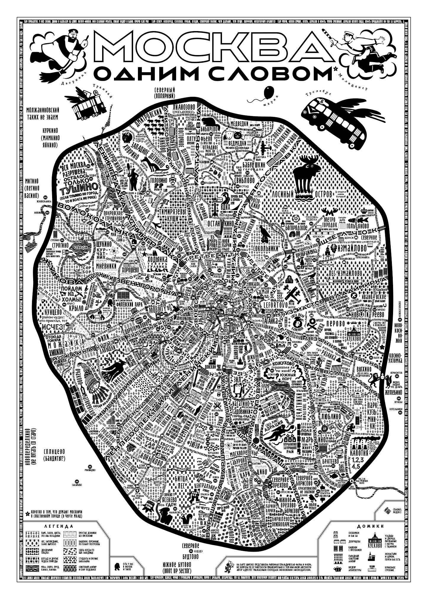
Moscow in One Word, 2016 · Official source ↗
Not a style, but a language
Yuri Gordon describes himself as an artist, designer, illustrator, type designer and writer. That list matters: in his practice a letter is never confined to a font file. It can be a tool for reading, a portrait, a map, a joke, a historical argument or the structure of an entire publication.
He trained as a book artist and says he has worked professionally since 1976. In 1997 Gordon, Olga Vasilkova and Valery Golyzhenkov founded Letterhead, a studio built around unusual letters and unconventional design. His best-known book, The Book of Letters from Aa to Yaya, approaches the alphabet almost anatomically: each sign has construction, behaviour, history and personality.
Line one: the letter as a system
The first route through the collection follows type families and commissioned alphabets. The useful question is not “what style is this?” but “what rules let these very different characters speak together?” Width, contrast, rhythm and alternate forms turn drawing into repeatable language.
FaRer
Constructivism collides with the language of Soviet display lettering.
Gordoni
A hand-made serif that keeps irregularity inside a usable system.
Vokrug Sveta
A magazine display face developed from Rerberg and historical civil type.
Citizen M
An extreme display alphabet built for selection through alternate glyphs.
Hermitype
A museum unicase in which identity and alphabet become one object.
Digital October
Commissioned type as a voice for publication and place.
Line two: the letter as an image
The second route looks at scripts, type portraits and short verbal images. Here the border between type design and lettering becomes deliberately unstable. A word is designed for its particular meaning, while a font tries to preserve that energy across an alphabet.
Junglaer
Connected calligraphic forms turned into an unruly display system.
GuardyOla Dream Team
A script that treats rhythm and ligature as play.
Mandelstam: Life
A type portrait: biography translated into the material character of letters.
Mandelstam: Prose
One voice from a larger family devoted to the poet.
Acqua Aldina VF
A variable calligraphic script imagined as moving water.
One Word
Short verbal images where reading and looking happen at once.
How to study the collection
Compare one repeated character across the projects. Notice where a stroke behaves like a tool mark and where it becomes construction; where irregularity is repeated as a rule; and how Cyrillic is allowed to develop its own plastic logic instead of imitating Latin forms.
Sources and image policy
The biography and project descriptions are based on Yuri Gordon’s official biography ↗, his official catalogue ↗ and the Letterhead catalogue ↗. The project cards above lead to those primary sources.
Gordon is a contemporary author and the official catalogue licenses both font files and graphical display. Fontast therefore does not copy its specimens into the archive without permission. This first edition is a sourced reading route; work images and letter coordinates will be added only after explicit authorisation.